NOMAD ESPRESSO
06/23 – present
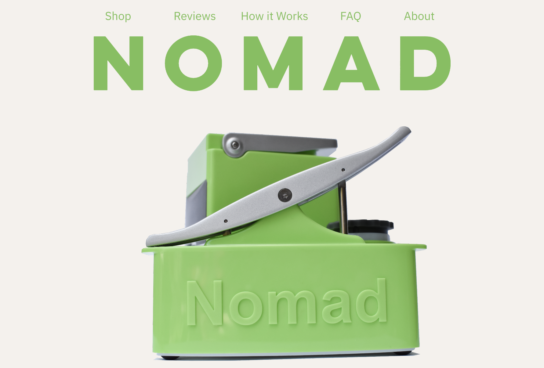
OVERVIEW
The Nomad is a compact, non-electric, lever operated espresso machine that began on Kickstarter in 2013. Invented and founded by Vincent Chen, the Nomad is technologically advanced, while being approachable and friendly to the amateur espresso enjoyer. Since June 2023, I have been working with Vincent and his business partner to redesign the Nomad’s website.

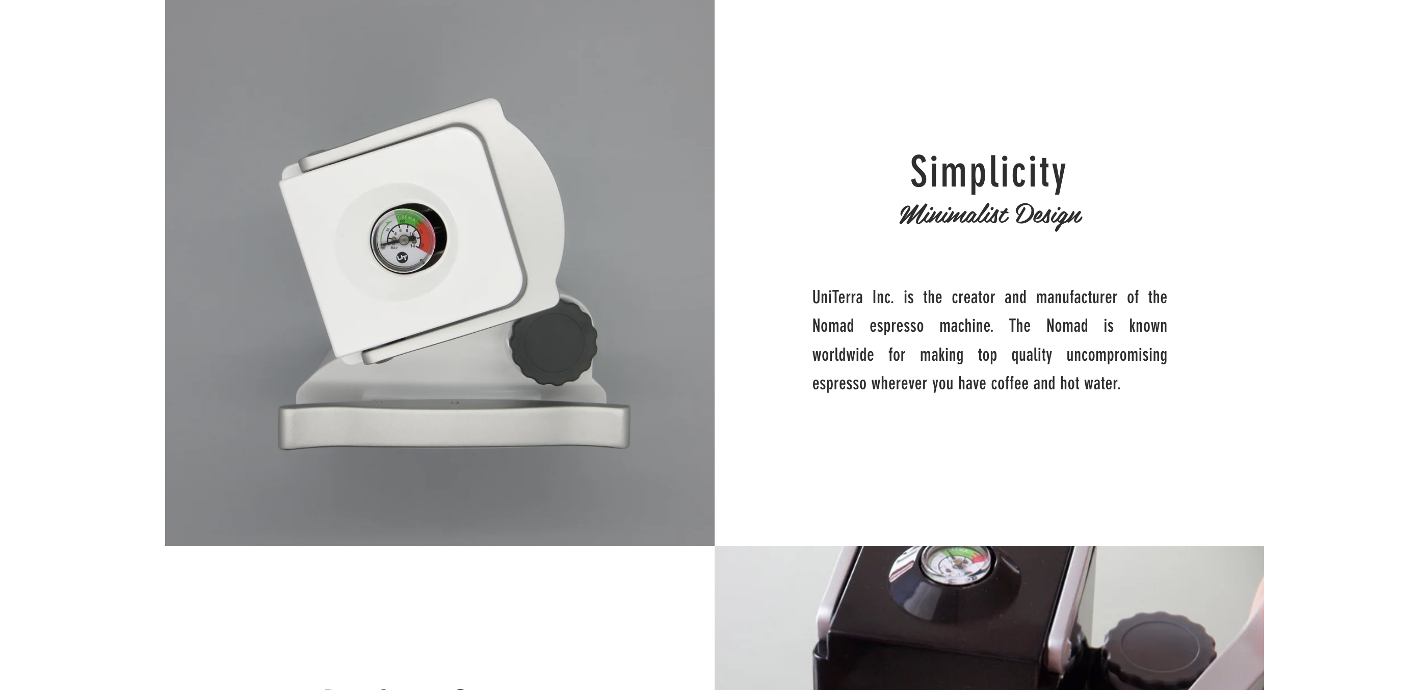
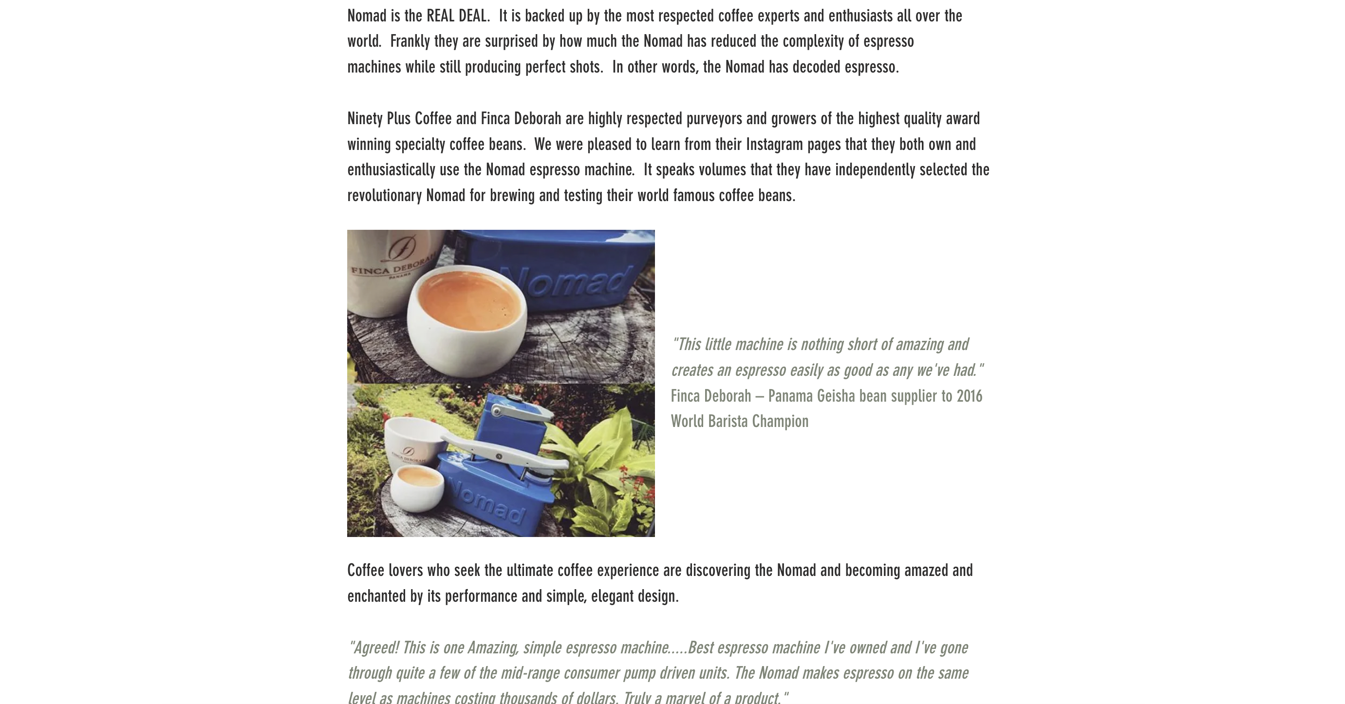
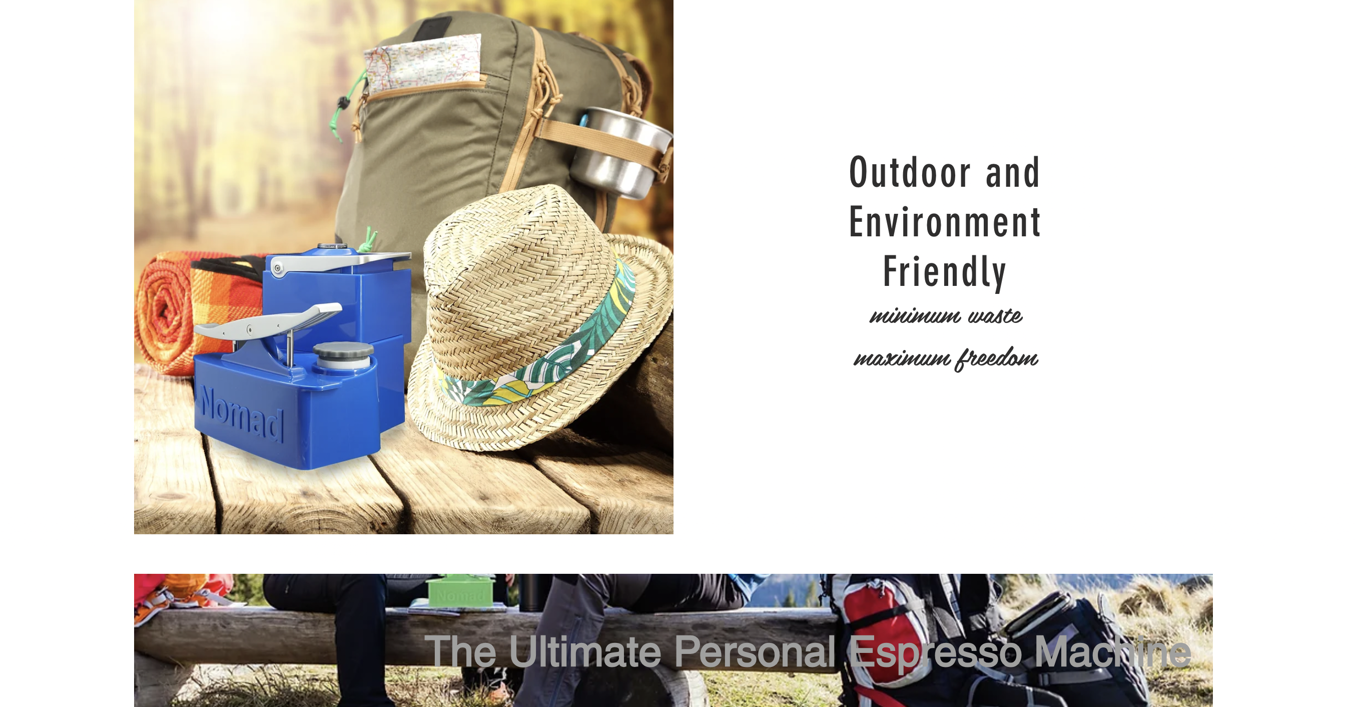
CURRENT EXPERIENCE / EXISTING PRODUCT AND ISSUES
When talking to Vincent, his initial thought process for the website was to convey the popularity of the product, as well as its unique functions through text. The current website (seen above) favors blocks of information to advertise the Nomad.
When asked about a redesign of his product’s website, Vincent responded with “clean and minimalist.”
As a customer and frequent user of the Nomad, I identified the product as a machine with a unique design and playful mode of creating espresso (you use a mini-seesaw to pump pressure and pull a shot of espresso). When placed in a kitchen, it stands out not only as an appliance, but also as a design piece.
I wanted to reorganize the website’s information and image presentation to highlight an impressive yet easy to use product. Yet, the website was disorganized, held discrepancies in text, grammar, and photo quality, and favored blocks of text over images and videos. For every critique I had for the website, I described a potential solution before moving forward to mockups, which can be found here.
COMPETITIVE ANALYSIS
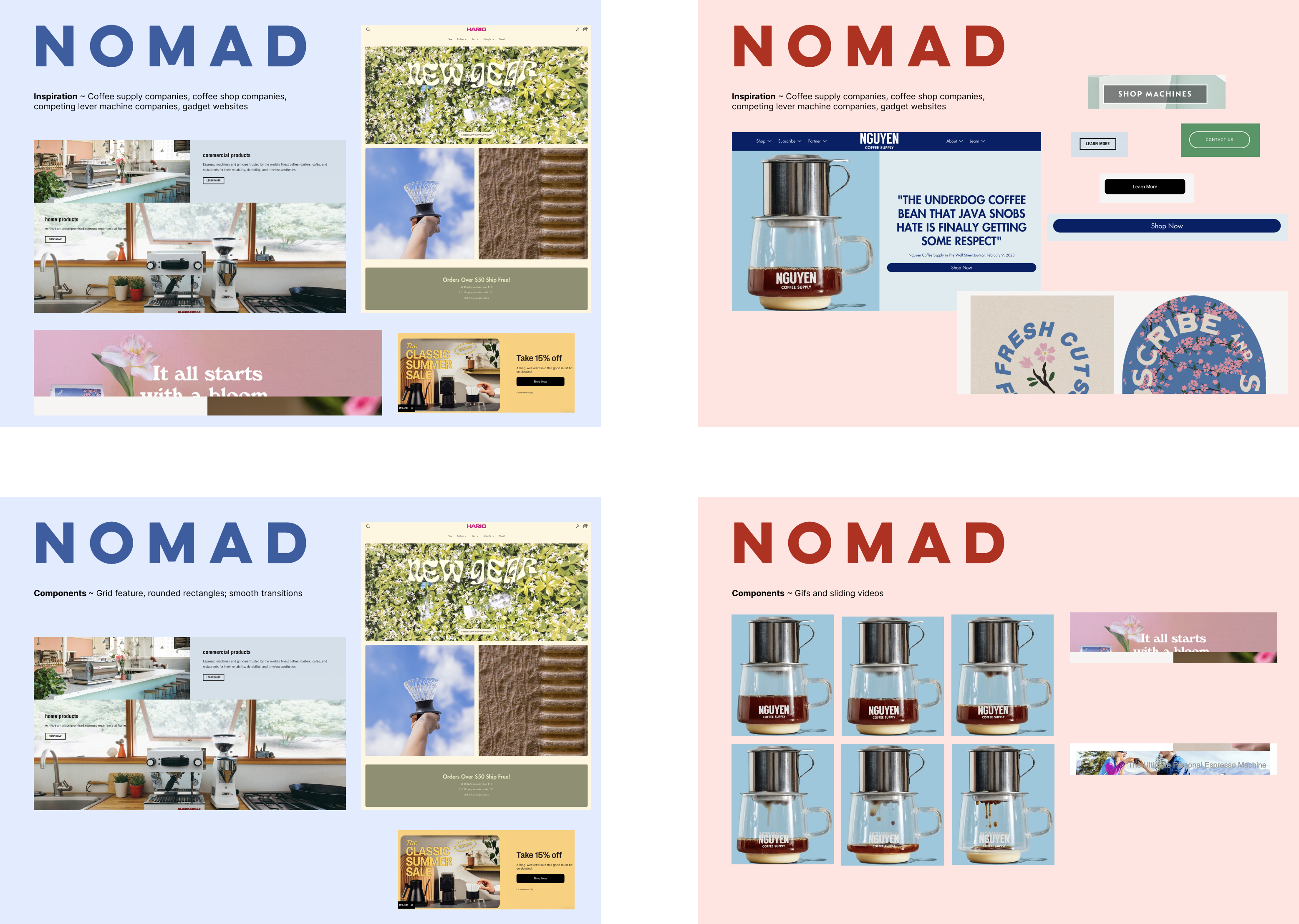
I analyzed the websites of coffee shops, coffee roasters, and coffee supply companies to gain a better understanding of how they advertize their products. Some key players include Hario, Nguyen Coffee Supply Co., La Marzocco, and Stumptown.
I focused on how both startups and national companies effectively communicated the specifications of their complex products to prospective customers. I asked questions like 1) What catches my eye on the home page of a product? 2) How are these companies catering towards a specific audience 3) How quickly could I understand the navigations of a website?
I found 1) an emphasis of high quality photos and videos on every website, 2) an abstraction of information to allow interested customers to dive deeper into the technical specs of a product, without overwhelming prospective buyers from the start, and 3) a clean navigation bar and clear phrasing that defined each page.
The Nomad website lacked these three crucial elements, which I sought to fix in my redesign.
ITERATIONS / EXPERIMENTATION
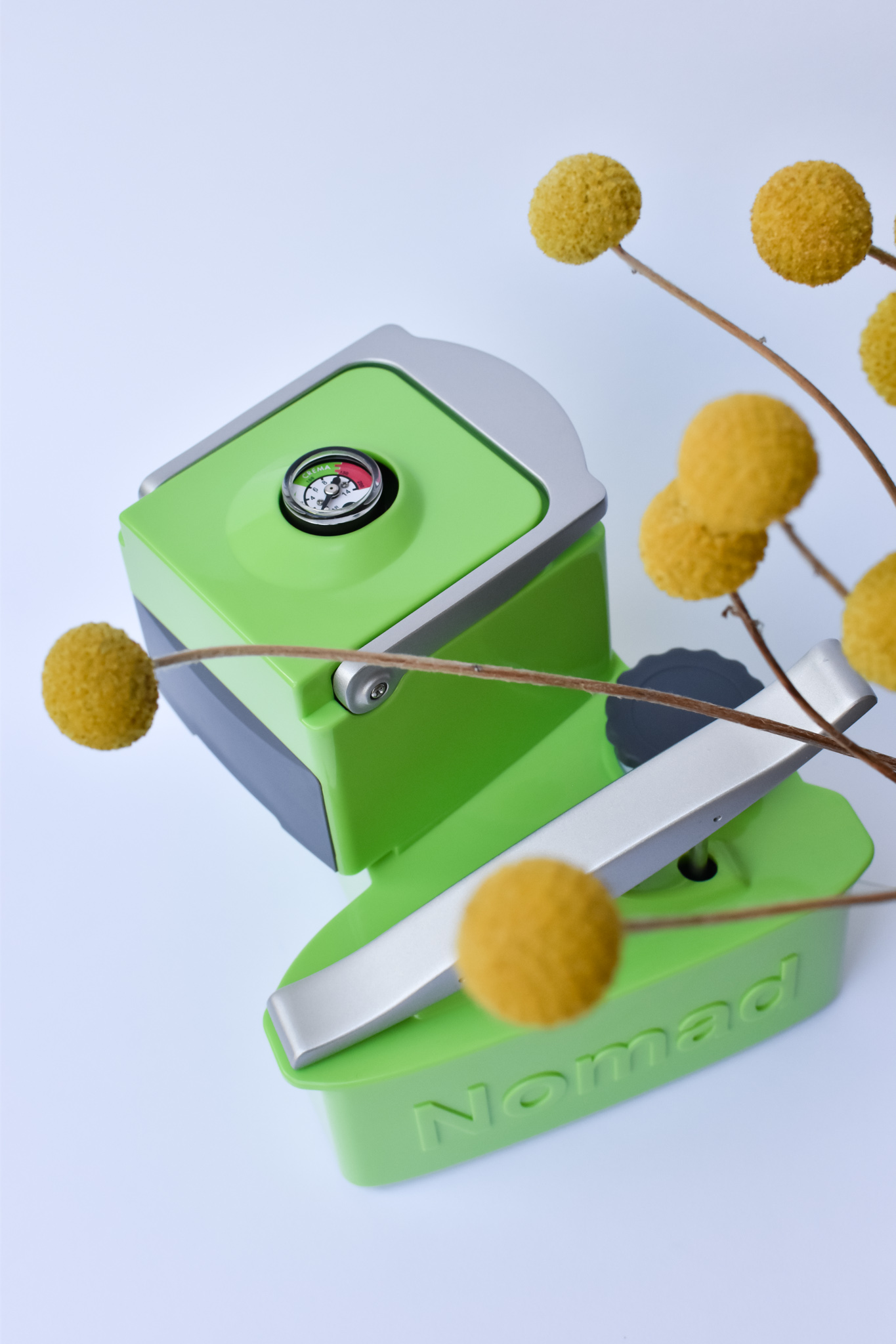
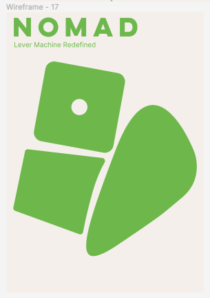
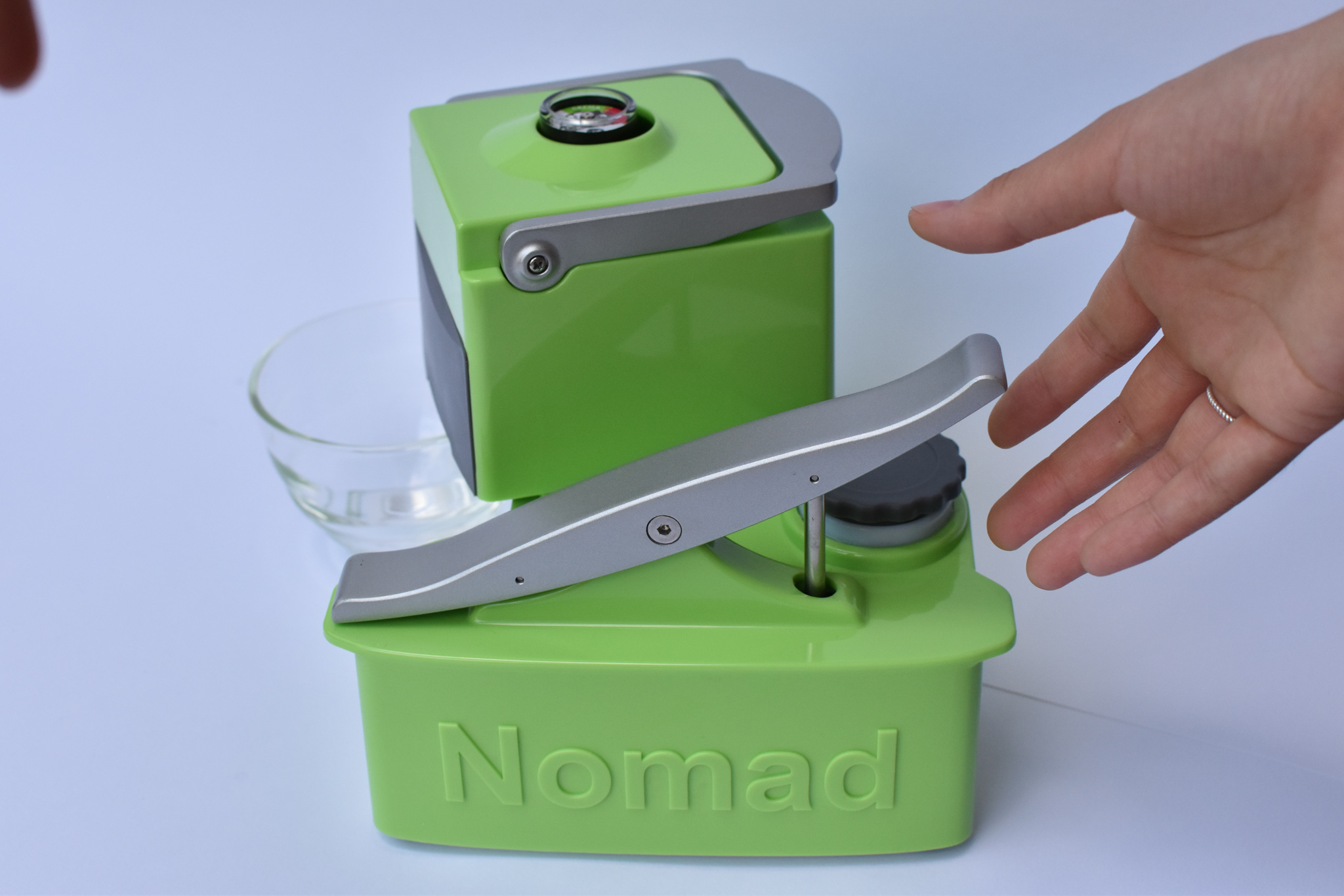
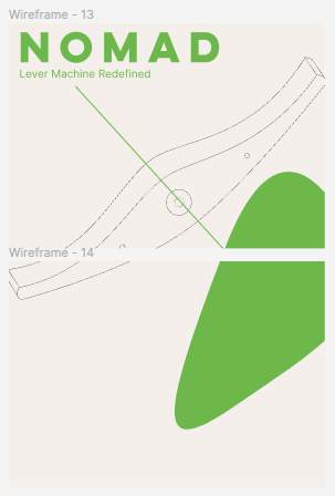
I thought about the Nomad and its geometry. What makes the Nomad unique in physical design? How does its volumes make it feel playful? I looked into incorporating the Nomad’s shapes throughout the website.
I then considered the Nomad and its relationship with the consumer. How does the Nomad encourage a first-time user to navigate its physical shape? What are the mechanical elements I should highlight throughout the website?
To address the lack of high quality photos and videos on the website, I photographed a Nomad myself in consistent lighting to serve as an example of how consistent lighting and angles can pull together a product across its own website.
I not only edited the copy throughout the website to decrease repetition, but I also reorganized the presentation of information on the website. This allows customers to get a clear, high level idea of the product before having the option of diving deeper to learn more about the mechanics.
For each page, I asked myself: what is the critical information that must be added? Are there copy edits to what was on the original website? What is the tone of this page? How can this page be more user friendly? Do all photos and videos convey some fact about the product?
I also adjusted the navigation tools on the website to more clearly indicate the pages it represent.
CURRENT MOCKUP
In addition to directly responding to the website’s existing issues, I wanted to emphasize the playful and user-friendly nature of the product as a way to loop in amateur and professional coffee makers alike.
I experimented with gifs to emphasize the product’s functions, photographed a new suite of product images to create a consistent presentation of the Nomad, and reorganized the product’s information across the website.
I also focused on shaving down blocks of text throughout the website, keeping only essential information while retaining the passionate voice of my uncle.
I am still working with Vincent and his business partner to improve their website.
You can find a recording of the UI mockup (with all connected components and animations) here.
Created with Figma, Photoshop.
[Last updated: August 2023]